Ana, who runs Folderly with me, asked me to explain how I actually design with AI — not the theory, the receipts. This is the long answer; the short one is the showcase at /good-taste. Either way, here we go.
Everyone says taste is the last mile now. It has become the thing you say about AI and design — the model does the work, taste is what’s left, here is my think-piece. So I want to earn the line instead of repeating it, and the only way I know to earn it is with receipts. This whole book is set inside one: the warm-dark page you are reading is a design system that shipped, broke, and got fixed, and the break is where I want to start.
The light theme looked finished. Flame-orange where the page wanted your attention, a terminal green for anything the system was reporting, warm off-white paper — it read clean, it shipped, and for weeks nobody flagged it. Then someone ran the actual numbers. The light theme had a quiet bug: its two accent colors were never re-tinted for light mode. They were still carrying the dark-theme values, tuned for near-black, and on a pale background, wherever they set small text — an eyebrow label, a receipt value — the flame measured about 2.7:1 against its background and the green about 1.7:1. The floor for body text is 4.5:1. Both were failures. Not failures of taste, where two people can disagree and both be right, but failures of arithmetic, where they can’t.
Here is the part that should sit wrong with you in the right way: nobody’s eye caught it. Not mine, across weeks of looking at that page. Not the model’s, when it generated the theme and saw nothing to flag. Not the screenshots. Everyone looked at it and everyone approved it, because it looked finished. The thing that caught it was a contrast check — a number, not an opinion. The fix was three lines: re-tint the light accents to darker steps of the same two hues until they cleared the floor.

That is the whole chapter compressed into one fix. A model can generate a plausible interface in seconds — confident, finished-looking, shippable. Whether it is right is a different question, and “plausible” and “right” are not the same word. The generator produces plausible. Correct is something a measurable check, or a human, has to add. Generation went to zero in price; judgment didn’t. So the argument of this chapter is not that AI can’t design — it obviously can — and it is not that AI replaces designers. It is narrower and more useful than either: the model generates, the human selects, and the system remembers the selection. Each section is that one sentence pointed at a different surface.
One boundary before I go further, because this is a book with receipts. Everything I write in the first person is Claude and Claude Code — that is the tool I actually ship this site with, and the site is the proof. Everything else — GPT, v0, Lovable, Midjourney, Figma’s AI — is researched or light personal use, current to June 2026, and labeled as such. I won’t fake a war story with a tool I haven’t shipped with. The flicked.email copy I quote later was captured from the live pages on 2026-06-16, and its colors and typefaces were verified the same day from the rendered pages, not guessed. The contrast numbers above are measured, not invented. That’s the line, and everything after it sits on the right side of it.
The miss hid because the test was wrong#
There’s a second half to that story, and it’s the more embarrassing one. The reason the contrast failure survived for weeks is that we did have a light-theme QA pass — and it was testing the wrong thing. The screenshots that were supposed to prove the light theme worked were captured by telling the browser to emulate a light-mode preference. But on this site the theme isn’t a browser preference; it’s an attribute on the page — a data-theme toggle the bootstrap script sets. Emulating the preference did nothing. Every “light theme” screenshot in that QA run was actually the dark theme, captured green, filed as proof. The check passed because it was checking a thing that wasn’t the thing.
That is the most common way AI-built work fails, and it has nothing to do with the model writing bad code. It’s a green check pointed at the wrong target. The lesson I had to learn twice: verify the capture, not the claim. A test that returns “pass” is only worth what it actually measured. The contrast gate caught the failure precisely because contrast is hard to fake — it reads the rendered pixels and does arithmetic. The screenshot QA didn’t, because it trusted a setting instead of looking at what shipped.
One taste is a single point of failure#
Both of those fixes — the contrast re-tint and the redesign that surfaced it — came out of the same piece of work, and the way that work was run is the next receipt. The page that broke was /research-notes, and I had tried to redesign it myself, alone, twice. Both times I looked at my own output and rejected it — once because it was just bad, once because it wasn’t enough. Solo judgment, iterated, kept landing in the same place: a local maximum I couldn’t see past because I was the only one looking.
So I stopped iterating my own taste and ran the redesign as a

The move is not “use more agents.” It’s that design review wants adversarial perspectives, not one opinion run through more loops. When you iterate alone, you sharpen the thing you already see. When you put four genuinely different readers on it — and one of them is paid to disagree — you find the thing you structurally cannot see, because the blind spot is yours and the only fix for a blind spot is another set of eyes with a different bias.
The system is the ruler#
A swarm is how you make one good decision. A
It’s a document — the design system these pages live inside, reverse-engineered from the live source by a
None of that is decoration about decoration. Every one of those rules is a past judgment, written down, so the model’s next generation starts from my decision instead of from the average of every website it was trained on. That is what a design system is for when you build with AI: it’s the ruler. You hand the model the ruler, and its first draft begins inside your constraints instead of regressing to the mean. The contrast gate that opened this chapter is part of that same ruler — a rule that returns a number. The 760-pixel measure is a rule. “Flame is intent, green is state” is a rule. Together they’re the part of the stack a vendor can’t ship to your competitor next Tuesday, because they aren’t the model’s capability — they’re your accumulated selections.
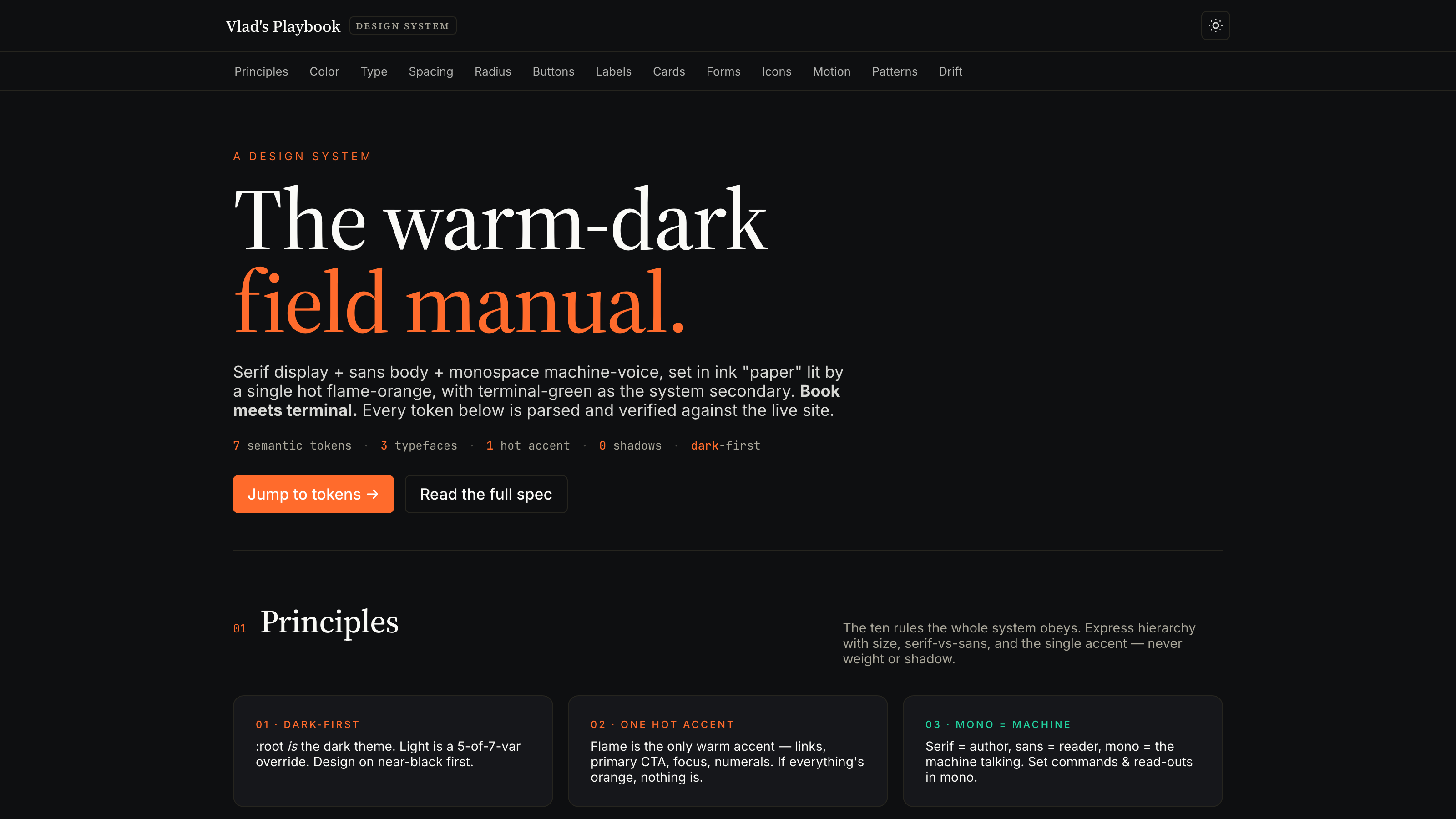
And because it’s a real system and not a brochure, it documents its own decay. The honest version of “we have a design system” includes the backlog of where it’s drifted, and ours is specific: the small uppercase label above almost every section — the most-used atom on the site — has been built ad hoc roughly 108 times across nine sizes and nine letter-spacings, because for a long time there was no single class for it. A whole numbered color palette sits about 95% unused. That backlog isn’t an embarrassment to hide; it’s the first fix. A system that can’t tell you where it’s drifting isn’t disciplined — it just isn’t measuring.
Three designs of the same product#
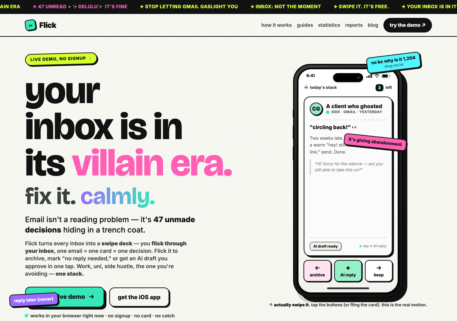
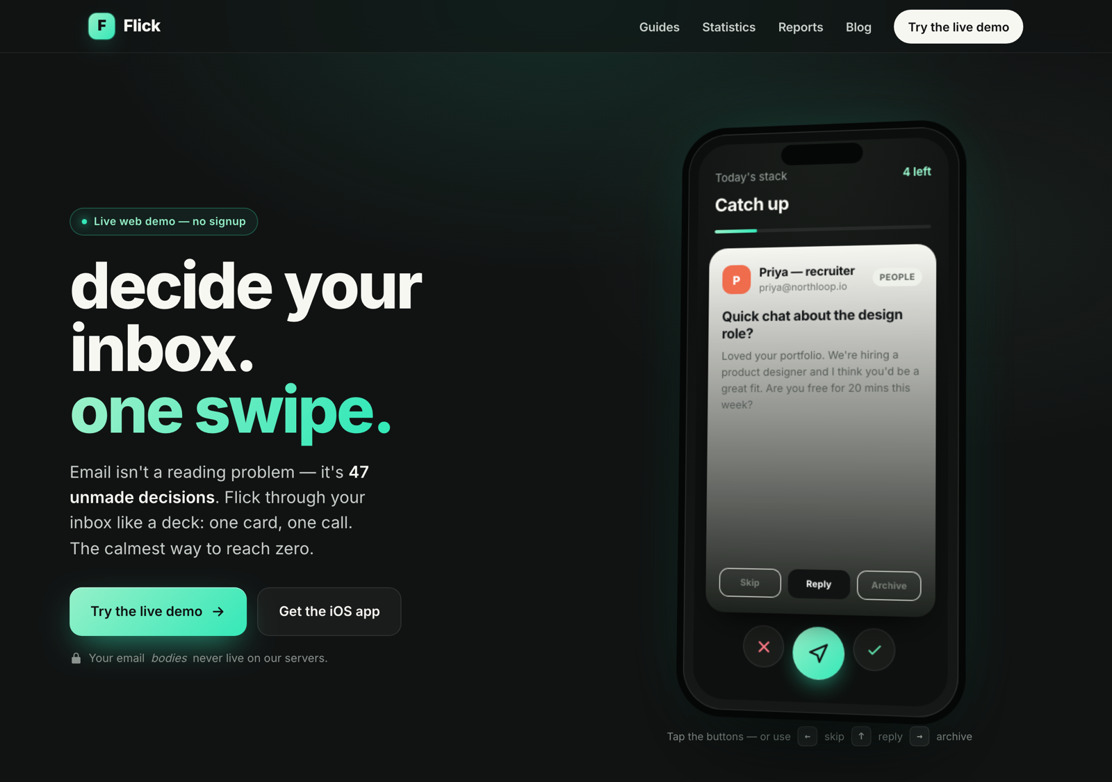
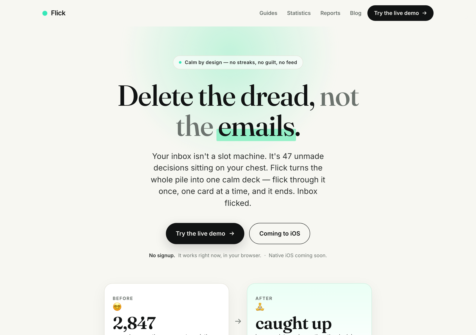
Here is the receipt I’d keep if you kept nothing else. Flick — my email app at flicked.email, where one email is one card and one swipe is one decision — does not have a landing page. It has three. Same product, same price, same swipe deck, same “archive, no-reply-needed, or approve the AI draft in one tap.” Three completely different front doors. And a model could have built any of them in seconds, because it did.
The product underneath is calm by design: email isn’t a reading problem, it’s a pile of unmade decisions, and the deck has an end you can feel coming. That’s the thing being sold. But the three pages sell it three opposite ways, and watching them line up is the cleanest proof I have that the model is not the one making the call that matters. The tell isn’t even the color — it’s the type. Each page reaches for a different heading typeface, and the typeface is the intent.
/ — the villain era (chaos). The main page opens loud: “your inbox is in its villain era. fix it. calmly.” Deliberate Gen-Z vernacular — “it’s giving abandonment,” “stop letting gmail gaslight you,” a “FREE FOREVER” in caps. It’s set in a display face, Bricolage Grotesque, on a light ground, splashed with four bright accents at once — hot pink, acid lime, purple, and the brand mint. Maximalist on purpose. The CTA doesn’t ask, it dares: “go flick something.” What it encodes: attention is the scarce resource; out-noise the noise, and let the calm product convert later.
/hype — reach zero in 90 seconds. The second page trades volume for momentum: “decide your inbox. one swipe.” / “Reach zero in 90 seconds.” / ”✕ No streaks.” It’s dark, set in plain Inter — no display face, no ornament, the urgency carried by contrast instead of decoration — with a single coral accent over the mint. It sells the outcome, and it turns the absence of dark patterns into the pitch. What it encodes: the reader already wants the result and needs to believe it’s fast and won’t trap them.
/calm — delete the dread. The third page is the product designing itself: “Delete the dread, not the emails.” / “Calm by design — no streaks, no guilt, no feed.” / “We make money when you stop.” Light, generous whitespace, one muted mint accent — and, the quiet tell, its headings are set in a serif, Fraunces. The serif is the whole argument: it slows you down, it reads as considered. What it encodes: trust through restraint. The page makes the same promise the product does — we want you to leave — and proves it by refusing to grab you.
| Design | Lead line | Supporting beat | Type & ground |
|---|---|---|---|
Chaos (/) | “your inbox is in its villain era. fix it. calmly." | "stop letting gmail gaslight you” · “FREE FOREVER” | display face, light, 4 neon accents |
Hype (/hype) | “decide your inbox. one swipe." | "Reach zero in 90 seconds.” · ”✕ No streaks” | sans, dark, coral accent |
Calm (/calm) | “Delete the dread, not the emails." | "We make money when you stop.” | serif, light, one muted accent |
Read down any one column and you have the whole positioning. Read across any one row and you have the same fact wearing three intents. None of the three is the “correct” one — that’s the lesson — but they aren’t equally good at everything either. Chaos wins novelty and shareability and picks a fight with its own calm product. Hype is the safest and sits a hair from contradiction: sell speed too hard and you’ve reintroduced the pressure the app exists to remove. Calm is the most coherent — design and promise are the same sentence — and it’s the easiest to scroll past, because the page that respects you is the page that risks being ignored. Three real tensions, three different right answers depending on who you’re selling to. The model surfaced all three beautifully. It cannot tell you which tension is worth eating.
This is why “make me a landing page for an email app” gets you something so forgettable. With no intent supplied, the model returns the median of every landing page it has ever seen — the centered hero, the gradient blob, the three feature cards, the pill-shaped button. That median is the house style. It isn’t a bug; it’s the visual signature of an absent decision. The instant you supply the intent — loud and meme-fluent, or fast and outcome-led, or quiet and trustworthy — the model becomes an extraordinary executor of it. The decision just moved upstream of the prompt, which is where it always lived. AI only made that obvious by removing every other excuse.
Which model for which design job#
There is no best AI design tool. There’s a best tool for a job, and the jobs don’t interchange — a first mockup is a different act from enforcing a token system, which is different again from catching a contrast failure before it ships. Pick by the job and the field sorts itself out. Pick by hype and you end up using an image generator to write production CSS.
I’ll say it plainly, per the boundary up top: the first-person column below is Claude and
- The first mockup. The job everything can do now, which is why it’s the least interesting. Claude artifacts give me a live preview in the chat; Claude Code writes the same thing straight into the repo. The researched competition is real: v0 emits clean, shadcn-native React and one-click-deploys; Lovable goes one prompt to frontend, backend, auth, and hosting; Figma’s AI turns a prompt into an editable first draft inside Figma. For a mockup that becomes real code in a repo, the agent-in-the-repo; for a throwaway clickable prototype, any of them. The first screen is never the differentiator.
- The design system / tokens. Where the field thins fast, because a system is a constraint the model must obey across hundreds of later generations, not a one-shot. This is Claude Code’s home turf — tokens only matter if something reads and enforces them in the actual codebase. The researched tools mostly consume a popular default (shadcn, Tailwind, a Figma library) rather than author and enforce your house system.
- Copy in the UI. Underrated as a design job — the words are half the design, as flicked’s three pages prove. Claude holds voice and context across a long thread, so it’s my default. The researched note: ChatGPT writes strong microcopy but, by most 2026 accounts, can’t place it inside your production system.
- The accessibility fix. The unglamorous, highest-value job — and the one this chapter opened on. No model flagged the 2.7:1, because they all generate something plausible. The fix came from a check that returns a number. Any capable code agent can propose a fix; the moat is the objective check that grades it, and a check isn’t a model — it’s a measurement.
- Mood and iteration. Midjourney (researched) is the odd one out — not a code tool at all, but a mood generator, useful for finding a visual direction before a line of CSS exists. v0 and Lovable spin fast variants; Claude lands the winner in the repo.
| Job | First-person (Claude) | Strongest researched alternative |
|---|---|---|
| First mockup | Claude Code → real files | v0, Lovable, Figma |
| Design system / tokens | Claude Code (reads + enforces) | weak field — most consume, don’t enforce |
| Copy in the UI | Claude (holds voice + context) | ChatGPT (good words, no system) |
| Accessibility fix | Claude Code + an objective check | any code agent can propose; the check decides |
| Mood / iteration | Claude artifacts / Code | Midjourney (mood); v0, Lovable (variants) |
Read the table honestly and a shape appears: the dedicated visual tools win the front of the funnel — the first screen, the mood, the throwaway prototype — and the agent that lives in your repo wins the back: system enforcement, the accessibility fix, the handoff that has to survive a year of edits. If you were assembling a stack from what’s out there, the researched shape is mood in an image tool, a mockup in a builder, then build-enforce-fix-and-ship the real thing in a code agent — and let one measurable check, not any model, be the judge of “right.” That sentence is the whole map, and it restates the spine: every one of these tools generates plausible interfaces in seconds, and not one can tell you which is correct for your system, your accessibility floor, your positioning.
Designing the images, not just the layout#
A design system tames the layout. It does nothing for the pictures — and on a real landing page the pictures are half the design: the hero, the section backgrounds, the thing that makes a page feel like a place instead of a form. So when I needed art for a product called Reach, I did exactly what the rest of this chapter says not to: I opened an image model and typed “moon base landing page for an email product,” with no art direction at all. What came back was the visual version of the cold open — technically a moon base, completely off-brand. A purple glow. A floating astronaut. A fake dashboard with three invented stat columns. Slop.
Same failure, new surface. An image model with no art direction returns the internet’s average, not your taste — the visual house style, the same way an ungoverned coding model returns the centered hero and three cards. The fix is the fix: supply the intent before you prompt, and write the intent down so the cohesion repeats. For pixels, that written-down intent is a taste skill.
One honest note, because it proves the last section instead of dodging it: Claude doesn’t generate images. This is a job you reach fully outside Claude for — the Reach frames below were made with an image model — ChatGPT’s image generation — not Claude. That’s the “which model for which job” rule made literal: pick the tool by the job, and label what’s yours. The image model is the brush. The art direction is the part that’s mine, and it’s the only variable that moved.
Art direction is intent for pixels#
There’s a public skill for exactly this — imagegen-frontend-web, part of Leon Lin’s taste-skill collection. It isn’t mine; it’s just good, and crediting the person whose ruler you borrowed is the whole ethic of stealing skills. Stripped to what an operator actually does, it’s five moves:
- One image per section. Never a collage. An eight-section page is eight separate frames, generated one at a time. A single tall slice lets the model fudge hierarchy and clone one composition eight times; one frame per section forces a real decision each time.
- Kill the default hero. Left-text / right-image is the most overused AI hero on earth, so it’s banned as a starting point. Reach for centered-over-image, bottom-left, image-as-canvas, off-grid first. The pre-flight question every time: am I drawing this out of habit?
- Pick one of each variable, then hold it. Before prompting, lock one option per axis — theme, typography, hero architecture, motion language, a narrative spine, a single “second-read” moment — and keep it constant across all frames. Variation lives only in the per-section composition and background. That’s how eight images read as one site instead of eight stock pictures.
- Run the anti-slop ban-list. Name the tells out loud so the model can’t reach for them: no purple-blue glow, no floating blobs, no fake KPI columns, no gradient-text-as-premium, no “unleash / seamless” copy. Naming the cliché is what kills it.
- Assert consistency; don’t assume it. Every frame is its own generation, so cohesion isn’t free. I locked it the cheap way: generate the hero first, then feed that frame back as a reference image for the other seven, all on one brief.
That is the design-system move pointed at pixels — generate, select the variables, write the selection down. And it isn’t magic: image models are stochastic, the same brief gives a different frame each run, so the honest description is that the art direction biases the model and you cull the misses — not that the model obeys.
The worked example: Reach’s moon base#
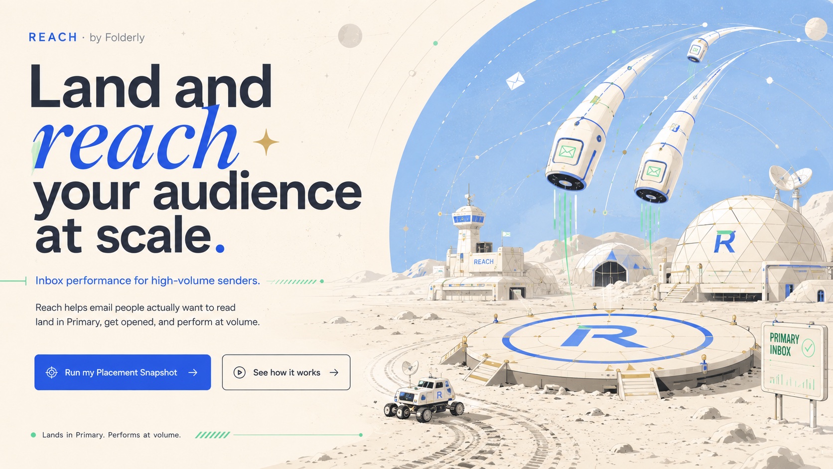
Reach by Folderly is a pre-build inbox-performance product — the moat is deliverability, the product is placement and engagement: making sure every send lands and performs. (Honest flags: it’s pre-build, the name isn’t publicly locked, and what follows is an art-direction study, not a shipped, scaled site — there are no metrics here because there’s no product to measure yet.) The tagline direction: land and reach your audience at scale.
The intent I locked was a moon base, and the metaphor does the work: the moon base is your audience’s inbox, the territory you’re settling; emails are capsules landing on an R-branded pad marked PRIMARY INBOX. That one image carries the positioning — lands-at-scale is capsules touching down, performs-not-just-delivers is that the pad is primary, not merely “arrived.” The locked dials: light mode, one muted blue on warm paper, a single illustrated moon-base world, capsules-in-transit as the only motion. Then the page, section by section, each a different composition anchor so you can watch the world hold its shape: an image-as-canvas hero (land and reach your audience at scale), an ESP-integration band (keep your ESP — add Reach), an off-grid “how it works” (land. perform. scale.), a “new layer” explainer, and a design-partner call. Same world every frame; never the same layout.
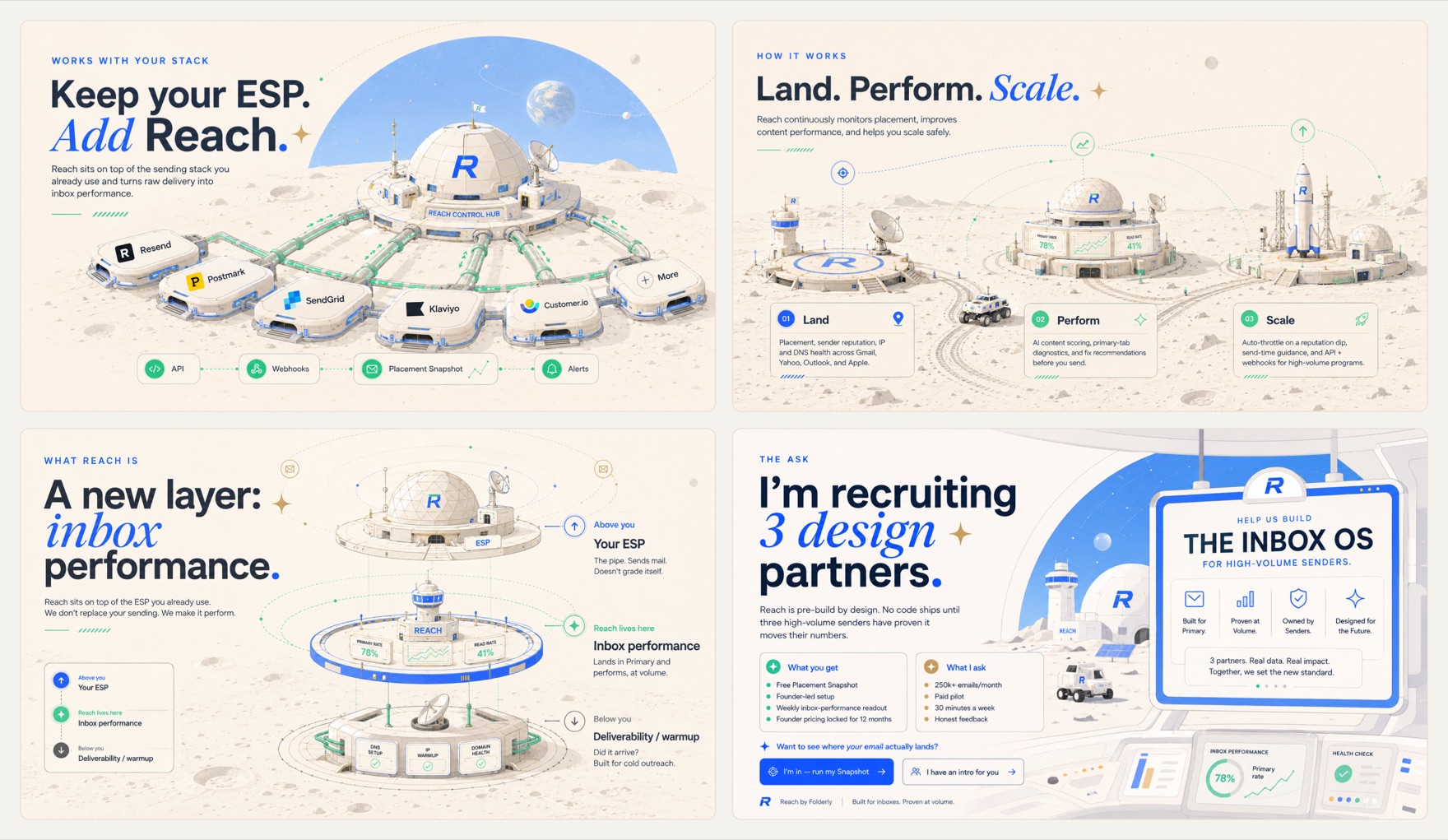
Different layouts every time, one unmistakable world. The image model never learned anything between the frames. The art direction did all the holding.
Steal the skill#
The skill is public and MIT-licensed — Leon Lin’s taste-skill, original at tasteskill.dev; I share a fork at github.com/Belkins/taste-skill — and because it’s a collection, the imagery siblings travel together: imagegen-frontend-web for sites, imagegen-frontend-mobile for app screens, plus brandkit and a dozen more house-style skills. Install it, override the brief, keep the discipline — and credit Leon, because borrowing someone’s written-down taste and pretending it’s yours is its own kind of slop. (I put a before/after showcase at /good-taste — the generic-slop default next to the same brief, directed.) The repo’s one-line pitch is this whole chapter in seven words — it stops the AI from generating boring, generic slop. Because slop was never the model’s fault. It’s the absence of a decision. Supply the taste, write it down, and the model executes against yours instead of the internet’s average. Same move as the design system — a different surface, the same job.
Taste is the last mile#
So back to the line everyone says, now that it’s been paid for. Everyone reading this is renting the same generator. Your competitor prompts the same Claude, the same v0, the same model in the same browser. Stop thinking the model is the edge — it’s a commodity with a price list, and the page that looks generic looks generic for exactly one reason: nobody made a selection. They shipped the model’s average and called it a design. What separates two operators a year from now is not the prompt. It’s the taste, and the record of the taste — the rulers you wrote down so the next generation starts from your judgment instead of the internet’s mean. That record has a name in this book. It’s the design system, and it’s the same moat as memory, pointed at how the thing looks instead of what it remembers.
Which is why flicked is the receipt I’d keep. One product, three landing pages, all AI-built and all good — chaos in a display face screaming your inbox is in its villain era, hype on a dark ground selling reach zero in 90 seconds, and calm, set in a serif, saying we make money when you stop. The model built all three equally well. It could not tell me which one was true. And here’s the convergence worth sitting with: the one I keep coming back to — calm, light, one muted accent, restraint over ornament — landed on the same instinct this entire book is set in. Not the same typeface; this book is set in Source Serif 4 and flicked’s calm page reaches for Fraunces. But the same move: a serif, a single accent, white space, and a promise to waste less of your time. Two different products, two independent humans, the same taste call. The model could have rendered any of the three. It could not have told you the restrained one meant something.
So the answer to “do I need to be a designer” is no. You need three habits the model can’t have for you, and a non-designer can run all three. Pick the intent before you prompt — chaos, hype, or calm; loud or restrained; what is this for — so the generator is executing a decision instead of guessing an average. Hand it your system, so its first draft starts from your ruler instead of from zero. And keep one measurable check — the contrast gate is the cheapest in the building — so when it drifts, and it will, you hear it from the arithmetic and not from a reader. The model does step zero. You own the rest.
Generation went to zero. Selection didn’t. That last decision — which intent is right — never left my hands, and it never will, because it was never a thing the model was built to do. That’s the last mile. The last mile is the whole job now.